Assignment Description.
The city of Amsterdam aims to make it easy for high school students to find reading books in the library. To achieve this, the library has introduced a kiosk setop to help with this task. I was tasked with designing an interface for this kiosk, which should be largely inspired by the city's branding, but could be adapted to the needs of the target group and specific context.
My part.
The "Boekenzoeker" (Book Finder) is an individual project of eight weeks, so I had full responsibility for the entire workflow, starting from designing wireframes to the creation of the high-fidelity design flow, the UX and UI, but also the protoyping process. I had some feedback from teachers helping me further too.
Creating the interface foundation with wireframes.
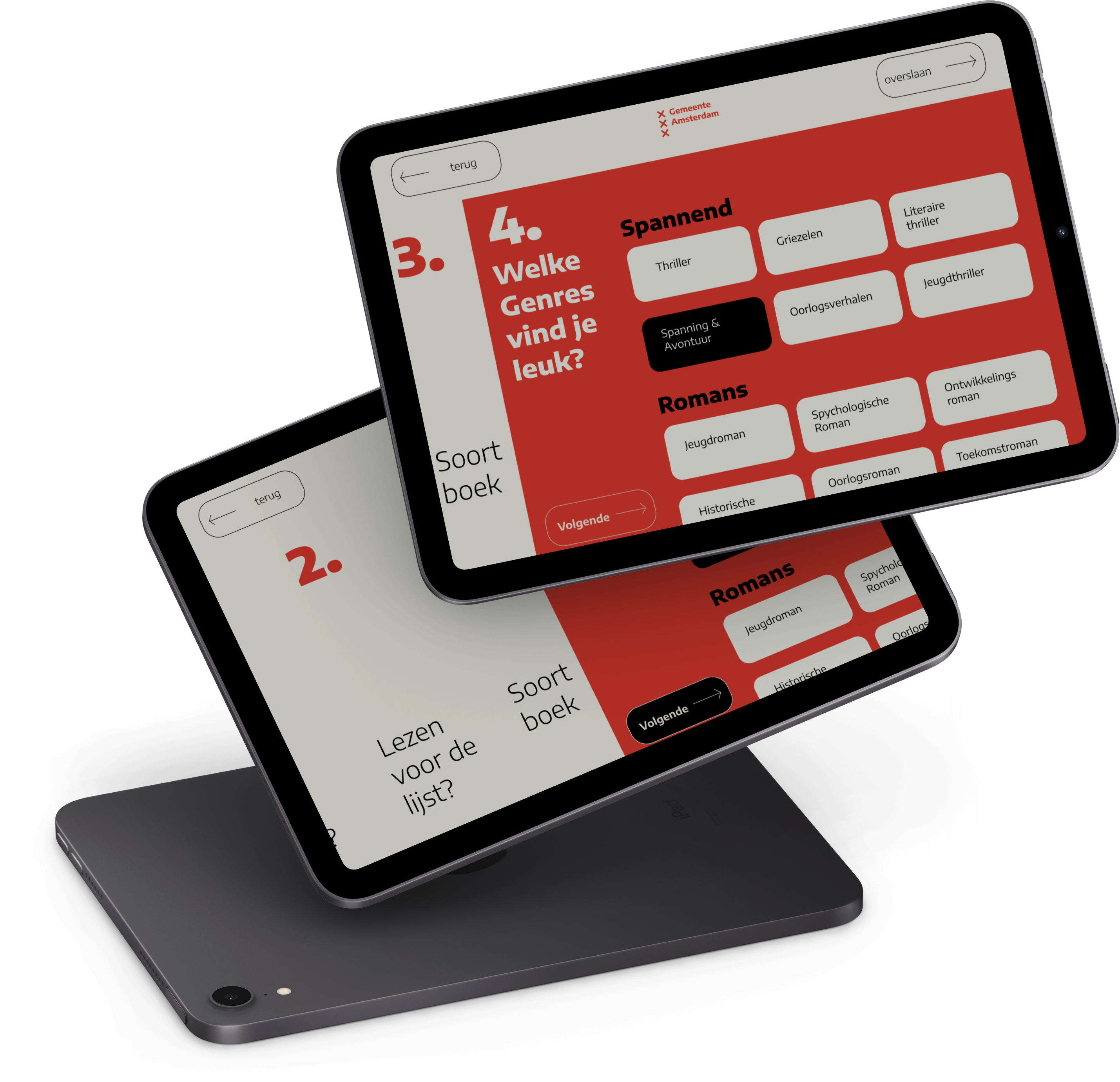
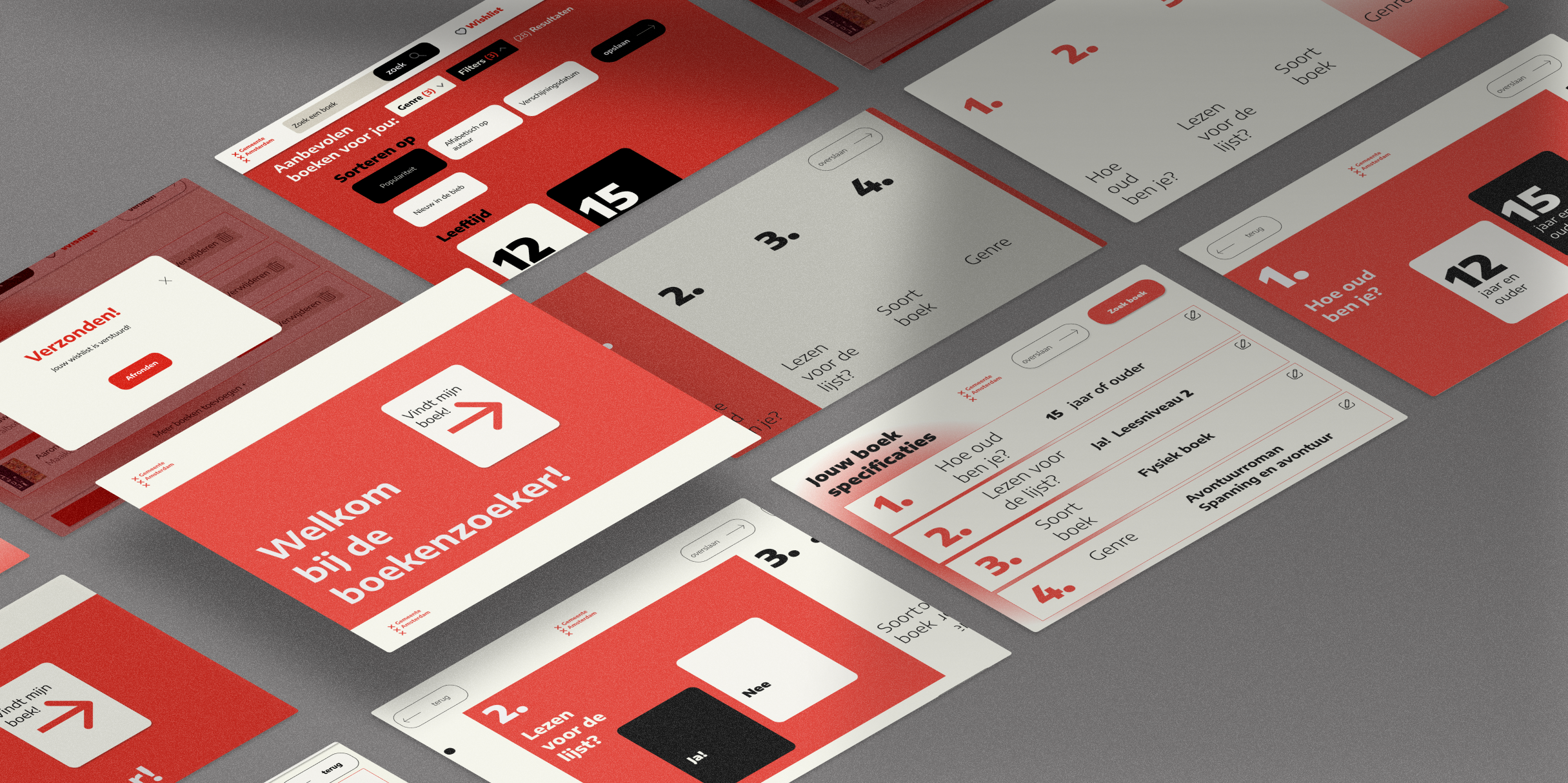
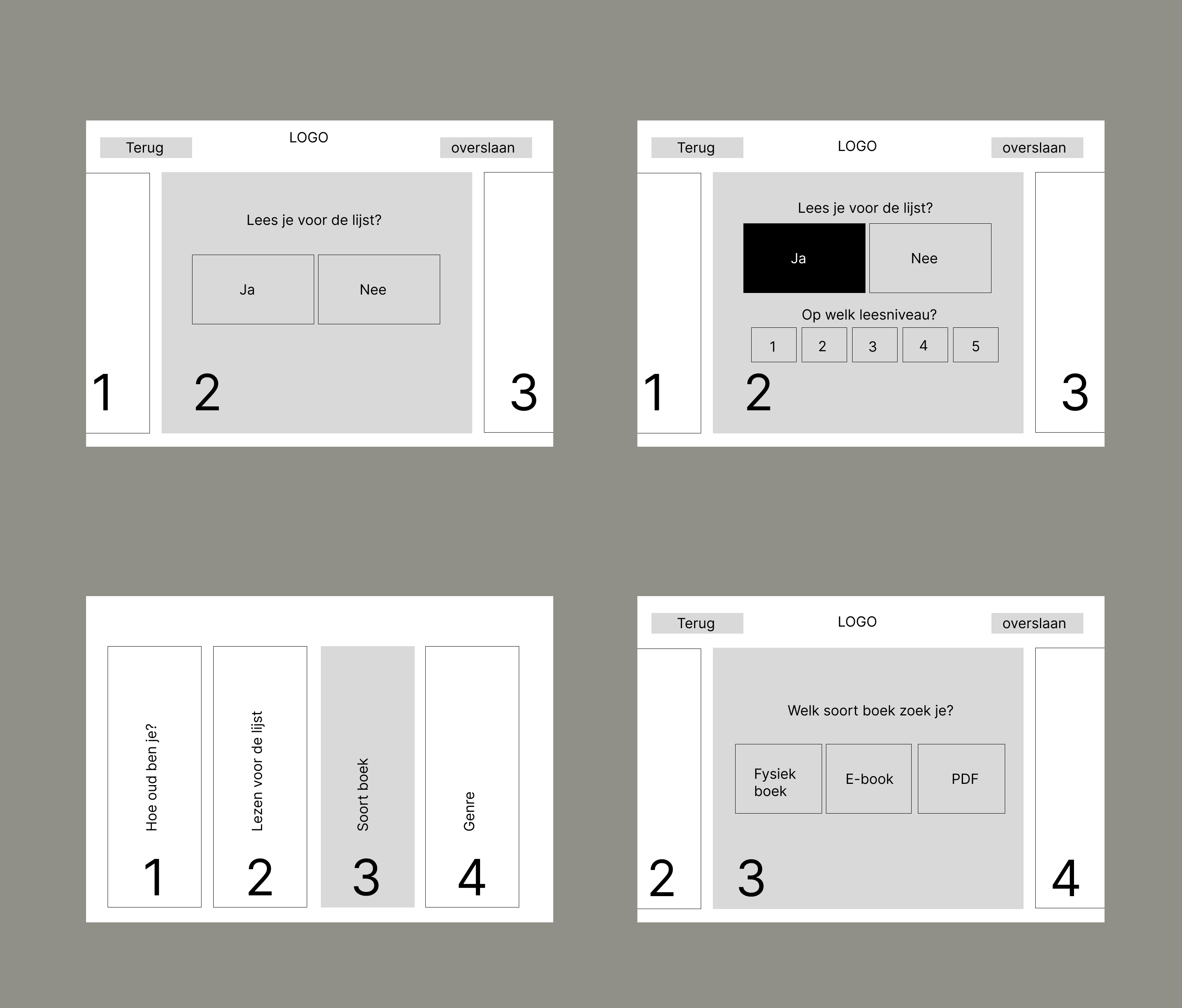
In the initial phase of this project, I began . My primary focus was on designing the screen layout. Since the kiosk is located at the entrance of the library, where people are constantly walking by, I found it essential to consider the time and environmental context of the users. As a result, I used clear color contrast and a "one primary action per screen” approach, ensuring that the interface is easily operable in such a specific situation, thus enhancing usability. I drew inspiration for the design from physical bookshelves, with the four vertical blocks symbolizing how books are arranged in a shelf.
Designing a modern and bold identity.
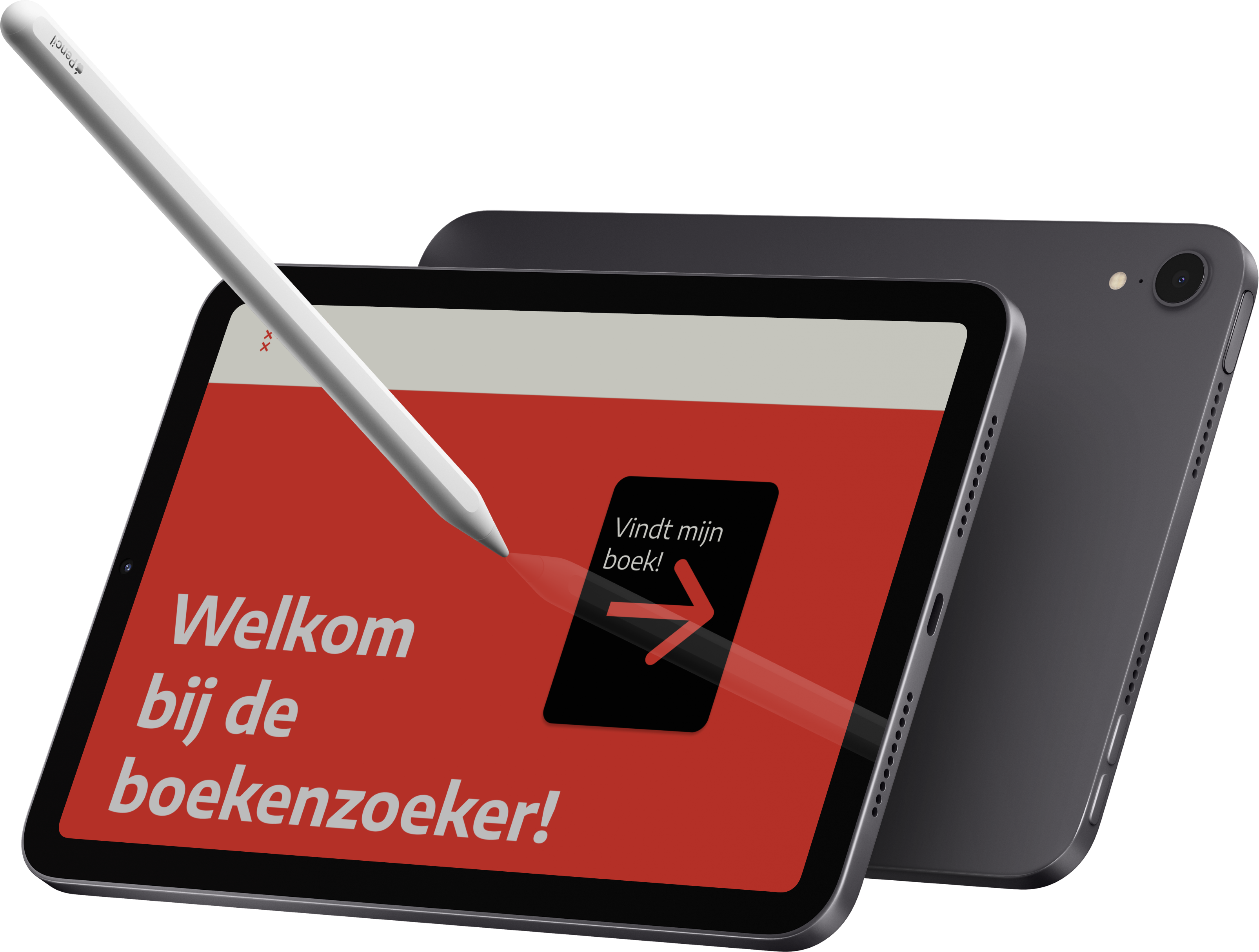
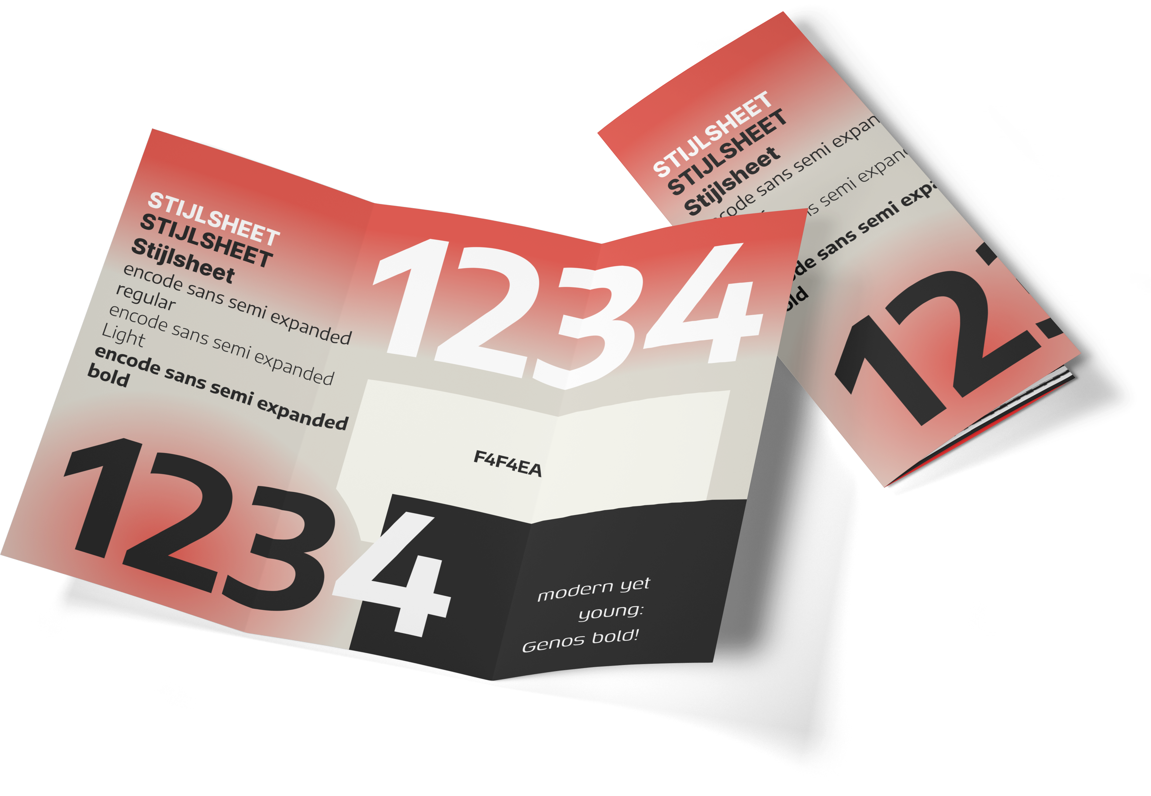
I started by experimenting with different design styles to explore which one would resonate best with the target audience while aligning with the city of Amsterdam's branding. During my style research for this target group, I discovered that "modern" is currently a key trend, especially when looking at design styles of brands like Apple. Another trend I noticed among the audience was the preference for bold, eye-catching designs, which are often seen in concert and festival posters.
Prototyping and adding micro-animations
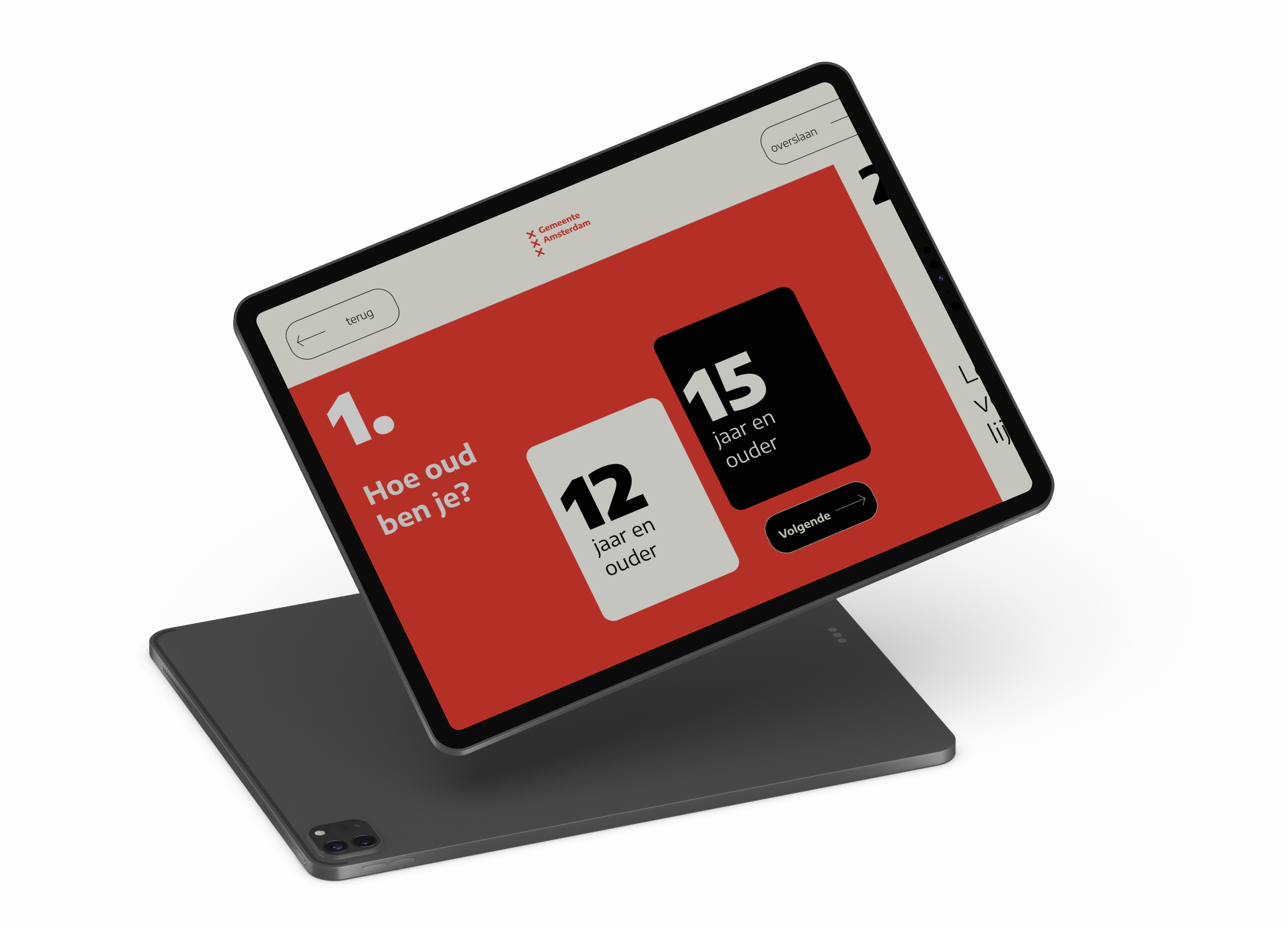
With the design style applied to all the app screens, it was time to make the prototype interactive. I connected all the pages and ensured that every interactive element was clickable with corresponding states. Additionally, a personal learning goal for me was to incorporate micro-animations into the app, with the intention of positively influencing the user experience. I made extensive use of these animations in the design. They support the user's actions and contribute to a pleasant, engaging experience.
Final result:
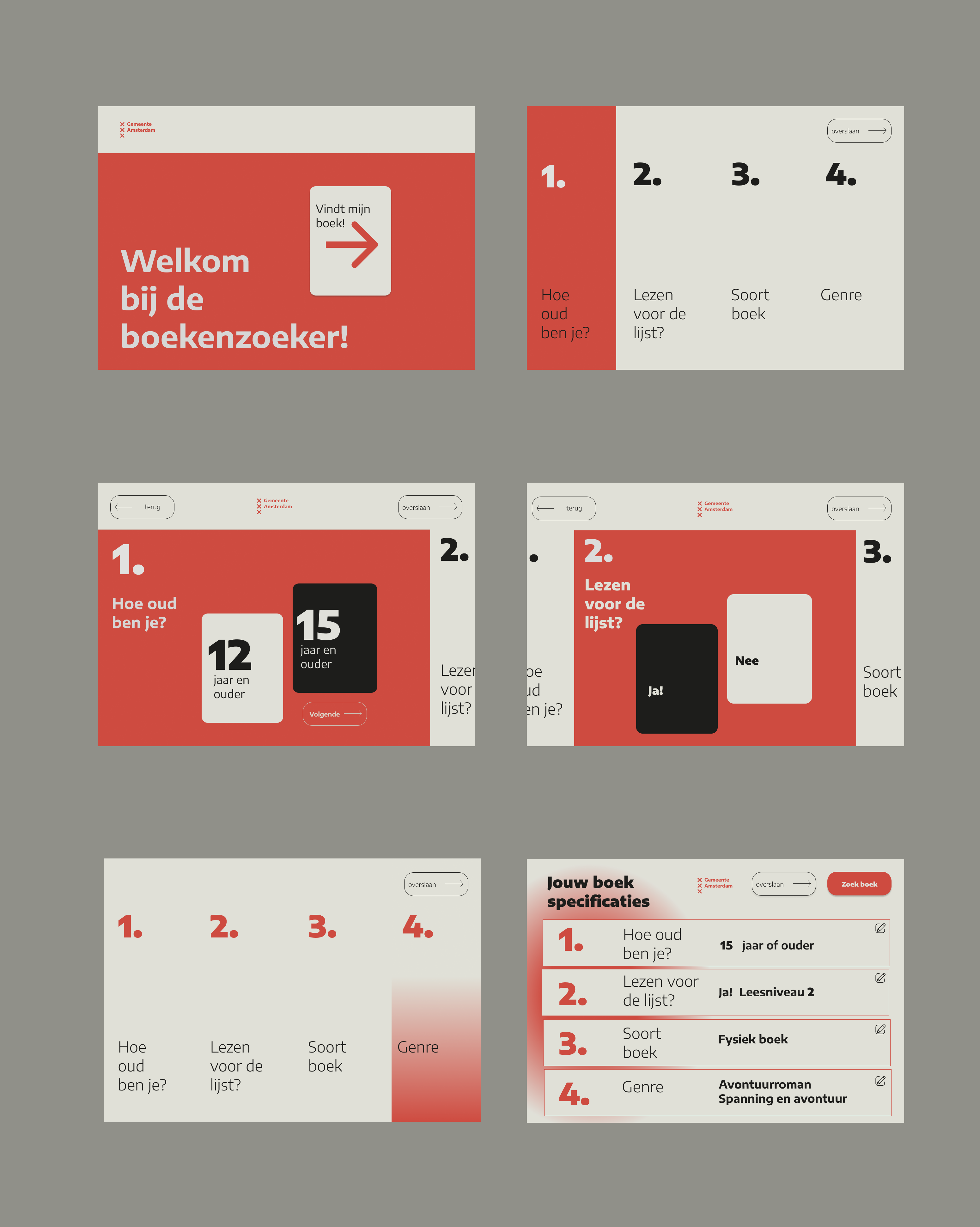
The "Boekenzoeker" (Book Finder) is an interactive experience that actively helps high school students find a suitable reading book. The modern and bold design fits well with the age group and engages the students in the search process. Smooth micro-animations assist in making choices and keep the target group engaged. The "Boekenzoeker" is a comprehensive visual solution that takes into account the time and environmental context of high school students, offering the city of Amsterdam a way to inspire students to become excited about reading books.
